Monday 31 January 2011

Screen Printing.

In our last print work shop we looked at Screen Printing.
Today I went and collected the ones I had done.

For the designs I looked at one of the other projects we are doing. That project is to create a type that looks like your favourite food. I have chosen marmite on toast for that one, so thought I would join the two and have some fun.

As I haven't yet created the type I chose to do the marmite pot. As we are doing two layers I first chose image of the marmite pot and then for the other layers I picked out some of the shapes from the marmite pot.


Shapes from Marmite pot.


Marmite Pot. 


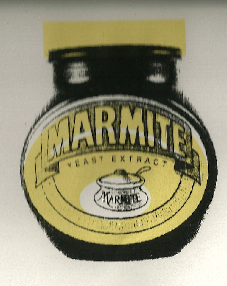
Over laying the two. 


Tuesday 18 January 2011

Doily + Dry point.

One of our new tutors is teaching us on different print methods. so far we have experimented with mono trace, mono type and mono texture. In our last lesson we looked into dry point. For this lesson I took inspiration from one my other projects and decided to create the doily shape and pattern. 

Quick sketch of outline of doily to see if it will fit in the Perspex square.

Dry point is where you scratch at the surface. In this lesson we scratched onto Perspex.  When you apply the ink it sits inside the scratches. The tone is built up through the lines. The way it prints onto the paper is by using damp somerset paper, which gives you the rich effect. This is a very traditional process that Rembrandt was known for. 


What the sketch looks like with dry point.

Thursday 13 January 2011

Pure Loveliness

One of our small deadlines was to present what inspires us. Could be anything, didn't just have to stick to design. We simply had to pick five of those inspirations and explain why they have inspired us.

For my presentation I chose five pieces of inspiration from the past four years. Showing how across time my inspirations have changed, and how they have effected my work.

One of my fellow classmates is currently researching into viral movements and paper mechanics. During his presentation he showed a video called "A Short Love Story" by Carlos lascano When I saw the video I instantly fell in love with it....


The best way to sum up this video would be through this quote (which was found under one of the comments underneath the video) : A couple of pencil-outlined birds escape from a little girl´s drawing, leading us through the life she dreams of.

I think aside of the story, which is just adorable, the other reason I enjoy it is because of the textures and... roughness I guess you could call it. The delicate handmade/designed backgrounds.


Wednesday 12 January 2011

KA-POW


A student zine.

Postcards of Initial ideas for the cover.


Final cover.


Few of the inside pages.


Tuesday 11 January 2011

Transition.

A flyer for an art exhibition called Transition.

Below is a publication which shows my journey of designing the flyer.


The flyer.


World In Words

Simply given the title - world in words. From that title we had to research independently and create a publication around it. My research led me into computers and how we now use them to communicate.