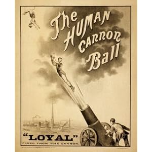
There are so many different variations; there are the 'retro' styles ones that use the brown paper for background with washed out colours and then on the other end there are the bright coloured ones with the use of creative typography. Oddly for me I'm loving the bright blue one which has 'More with less is more.' I feel everything just works on it, the composition of type, the use of screen print onto newspaper, makes me think of a fish'n'chip shop.
Sunday, 27 February 2011
Ahoy!
Still in love with all things Sailor/Navy!! Having so much fun looking at all the designs that have stemmed from them!
Thursday, 24 February 2011
Vintage Pin-up
For a recent brief titled 'Creative Arts Summer Show' the clients want to see four identity ideas from each designer. One of the routes I was led down after researching each word was sailors and the posters around them. That was after researching 'Summer' and the nautical themed bikinis that you can buy. Maybe I did jump a few steps ahead into something that might not fit the brief, but I just love the pin-up looks. It combines fun with elements of classiness.
Paper stencils!
Instead of getting a design exposed onto a screen we did it using purely paper...
Inspired by one of the necklaces I often wear. The style is quite simple due to limited time in the print room. But saying that I like the simplicity, means the silhouette shines through more. For once I also worked with a bright pink! Gradually starting to work with bright colours and be a bit experimental.
Tuesday, 22 February 2011
I Heart Shoelaces and Napkins
I have already uploaded some of my screen prints but for some reason I am now a fanatic of them!
One of the screen prints that I did, the design was hand-rendered (previously I had used designs created on the computer). For this I painted straight onto acetate :
The paint versions of little sketches.
As the designs are painted straight onto the acetate texture can be created by using different tools. For the shoelaces I thought I'd try some string and see what effect came from it.
What they look like once they have been screen-printed.
Here you can see what they look like once put on a screen and printed through. The texture of the string didn't really show through , however, the 'messy' edges give it a lot of detail that you wouldn't be able to create on the computer.
The teacup printed onto a napkin.
After doing the print of all the sketches I though I'd have a play around with them separately. Above you can see the teacup printed onto a napkin. I love them. I know that sounds a tad arrogant but I think they are quite cute. They could be improved by the amount of paint I use, some go a bit patchy, but once again mistakes are sometimes what makes a piece of design. As one of my old tutors used to call them - "happy accidents."
Little find.
Don't you love it when you find something that you had completely forgotton about!
The other day I was browsing through some blogs that I like, through this browsing I end up discovering new sites I like and spending three hours exploring instead of doing my assignments.... oops.
On one of the sites I saw these :
The other day I was browsing through some blogs that I like, through this browsing I end up discovering new sites I like and spending three hours exploring instead of doing my assignments.... oops.
On one of the sites I saw these :
How adorable is the typewriter ring! The thing I liked about these was how I didn't even notice the ring at first. The packets were the things that got my attention. I'll admit I'm a fan of the vintage look and these two designs definitely have elements of vintage in them, the faded material the use of minimal colours...
I feel bit bad at the moment as I can't track down the blog I saw these on, as soon as I find it I will add that up onto here, as they are divine.... and how can someone surprise me with one if I don't have the site written down.... <3
Friday, 18 February 2011
Printy print, cutty cut.
Today I spent time printing, then cutting, then printing, then cutting, then screen printing!!
Good eight hours of print and cut. But still I would say that it was worth it!
Good eight hours of print and cut. But still I would say that it was worth it!
Clearer photos to be uploaded soon.
Wednesday, 16 February 2011
Sandwich Boards.
After the last post I looked at how signs and posters were made.
One thing I noticed was how the signs were either made from wood or metal.
One thing I noticed was how the signs were either made from wood or metal.
This has made me question how I will make my poster and signage for D&ad brief.
Maybe I could make a sandwich board using screen print to put logo and text onto it...
D&ad added identity.
Now that I have my logo it's time for corporate identity and any added promotions etc ticket, poster. The signage around the hospital also.
Above is the signage and ticket. The ticket would be put on each patients tray at lunch time. So they know the exhibition is there.
After a discussion with my tutor we spoke about how to make the signage, and how to keep it in tone with the theme!
That means looking at how signs were made back in the day- how did they print and make posters and signs... thats the next step.
D & ad
For D & ad I chose to explore the idea of the traveling museum in hospitals.
So far I have chosen the name and from research came up with a concept.
Now for the making part!
The concept behind my designs began when I looked at vintage toys and their packaging, that was due to me thinking about what would appeal to a wide age range. The style of bright fun colours would attract the children and the vintage style would appeal to the older age and remind them of things from their childhood.
For the name I chose 'Den'. Do you remember being a child and building a den? I do, and I always had my teddy with me. I thought about how art is often treasured and when you are a child you would take your most prized possessions into your den. As you got older the place 'Den' changed and would be more of a study, but in that study you would still keep what is close to your heart in there (collectables, books, photos).
Above was my choice for the logos. I decided to go for the top one, as this fitted in with some of my earlier research of hanging puppets and signs. With the circus theme it now almost looks like an acrobat.
The bottom two are in the style of a ticket! One in circus colours and the other in candy-floss colours. The candy-floss colours were chosen after I looked at what you can buy/get at a circus.
Monday, 7 February 2011
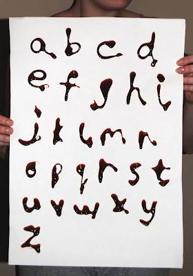
Hand made type
Marmite Typography!
Here is some type I created by using Marmite. Smelly work.
Closer look at some of the letters.
Marmite Screen print
These screen prints were illustrated by Chris Malbon and ink covered and screen printed at White Duck.
You can see the amazing detail in this poster, the shading in the fork and the marks in the bird.
I would never have guessed this was a piece of screen print from a far. The colour has been applied perfectly and the shadowing done immaculately.
Saturday, 5 February 2011
Identity
Creating an Identity. I went through many different things until I have finally ended up with something I feel is me, and something I like. The others I wasn't 100% happy with, didn't feel they were the right thing to represent me.
How I came to this idea was by thinking about elements of my personality. My Granddad used to describe me as a character and thats what led me to do the sketch that you can see as my header on this blog. I thought about other elements and one thing I tend to do it over think, about a lot of things. As that comes across as negative to a lot of people I thought about things I like and traced some sketches of them.
How I came to this idea was by thinking about elements of my personality. My Granddad used to describe me as a character and thats what led me to do the sketch that you can see as my header on this blog. I thought about other elements and one thing I tend to do it over think, about a lot of things. As that comes across as negative to a lot of people I thought about things I like and traced some sketches of them.
You can see that there is a flower, a biscuit, some shoes, a cat, a necklace, cup of tea and a doughnut.
These are things that are often in my day (well maybe not the doughnut, thats more a of weekly thing....).
Subscribe to:
Comments (Atom)


